Netflix’s New Design – Simply Terrible
I hate, hate, HATE the new Netflix layout. As an avid user, I’ve always appreciated Netflix’s intuitive design. But
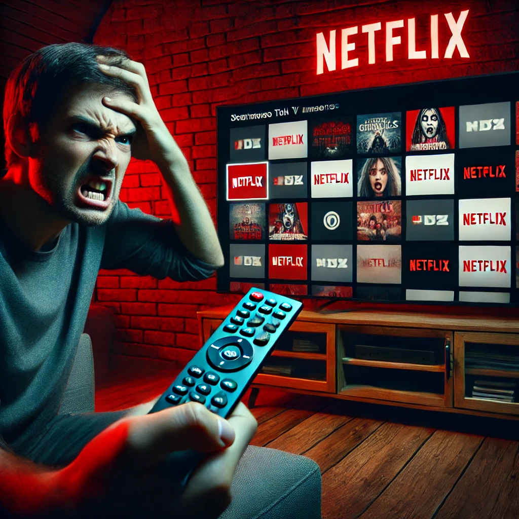
I hate, hate, HATE the new Netflix layout.

As an avid user, I’ve always appreciated Netflix’s intuitive design. But this latest update? It’s a disaster. The once straightforward interface has been replaced with a cluttered mess that’s anything but user-friendly.

The new design feels like a labyrinth. Finding my favorite shows now requires navigating through endless menus and submenus. The sleek simplicity that made Netflix a joy to use has been sacrificed for flashy, unnecessary features. It’s as if the designers forgot the old adage: “If it ain’t broke, don’t fix it.”
To make matters worse, Netflix has once again increased its subscription prices. According to a recent report, the monthly fees have risen across all plans, with the most expensive tier now at $24.99.
It’s infuriating to pay more for a service that’s becoming increasingly frustrating to use.
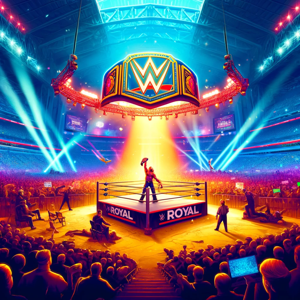
The only thing keeping me from canceling my subscription is the exclusive streaming of WWE’s Monday Night Raw. As of January 2025, Netflix secured a 10-year deal to stream Raw, making it the exclusive home for WWE’s flagship program.
As a wrestling fan, this is a significant draw. But even that might not be enough to justify sticking around if the platform continues down this path.
Netflix, please listen to your users. Stop making unnecessary changes to the interface, especially when you’re asking us to pay more. We value simplicity and ease of use. If these constant, unwelcome changes continue, even loyal subscribers like myself will be forced to reconsider our commitment.
What AI Says About the New Design
As of February 2025, Netflix has introduced several notable upes to its app design, aiming to eance user experience and content discovery.
Redesigned TV App Homepage
In 2024, Netflix began testing a significant overhaul of its TV app homepage. The traditional static tiles were replaced with expandable box that, upon hovering, reveal details such as synopsis, genre, and ratings. This design also introduced a simplified navigation bar at the top and incorporated the “My Netflix” category, previously exclusive to le devices, which consolidates everything a user has watched or save The global rollout of this redesign was completed by the end 2024.
Introduction of “Momentos” Feature
In December 2024, Netflix launched the “Momentos” feature for Android devices, following earlier release on iOS in October. This feature allows users to share clips from their favorite series and movies, enhancing the platform’s social sharing capabilities. To use “Momentos,” users need the latest version of Netflix app. While watching content, pausing the video provides access to the “Momentos” section, enabling easy sharing of preferred scenes with friends and family. This feature is currently available on mobile devices and is not supported on web browsers.
These updates reflect Netflix’s commitment to improving user engagement and staying competitive in the streaming market by evolving its platform with features that enhance both viewing and social interaction experiences.
Share this:

Discover more from BenHall.club
Subscribe to get the latest posts sent to your email.